If you go looking for the details of the wallpaper or background image sizes for the VVX family of phones you might fall into the same trap I did.
You might have seen this table in the documentation:
| Phone model | Optimal background image size (in pixels) |
| VVX 300 and 310 | 208 x 104 pixels |
| VVX 400 and 410 | 320 x 240 pixels |
| VVX 500 | 320 x 240 pixels |
| VVX 600 | 480 x 272 pixels |
| VVX 1500 | 800 x 480 pixels |
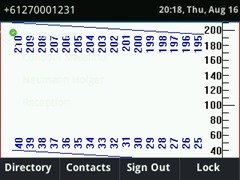
What isn’t immediately apparent is that this is the FULL screen size, not the USEABLE size. Place a logo too close to the top or bottom and it will be cut off by the “title bar” with the time display and line details at the top, or the softkeys at the bottom.
It also became clear in the process of testing this that despite the 400- and 500-series having the same absolute size, their useable size differ slightly, potentially requiring a different background image for each.
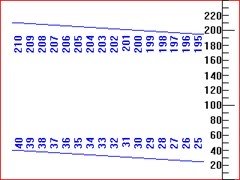
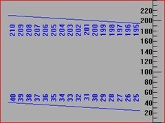
With some help from the hubby & Photoshop, here are some guidelines to help you prepare imagery for your phones, as well as the test images (if you want to do some testing of your own). Just click on them for their full-size images and then right-click to save them at their natural resolution.
Don’t overlook that these test images all deliberately have their border set as a single pixel of red against a white background, so you can tell if you’re seeing the edge or not.
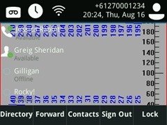
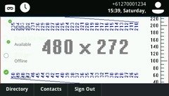
The numbers you see are recording the pixels from row 1 (the red line at the bottom) to its distant relative row 240 at the very top. The black graticule at the right is a course count, while the blue horizontal lines progressively mark more distinctly the areas where the phone’s on-screen information is likely to obstruct your background.
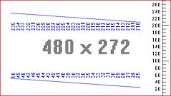
This one’s for the VVX600:
For bonus points, here’s a snippet of config code to help you out – and don’t forget the entire reference config is in my post Optimising the Polycom VVX for Lync/SfB:
<!-- Specify background image –>
<bg bg.color.VVX410.selection="2,1" bg.color.VVX411.selection="2,1" bg.color.bm.1.name="320x240_grey.jpg" />
<bg bg.color.VVX500.selection="2,2" bg.color.VVX501.selection="2,2" bg.color.bm.2.name="320x240_white.jpg" />
<bg bg.color.VVX600.selection="2,3" bg.color.VVX601.selection="2,3" bg.color.bm.3.name="480x272_Grid.jpg" />
<!-- Set "transparent" to 1 for the line keys to show the background underneath -->
<up up.transparentLines="1"/>
The *useable* screen size
Allowing for what I’m calling the “title bar” at the top and the softkeys at the bottom, the useable height drops.
VVX 400
For a 400-series phone (320px wide by 240px high) you wouldn’t use the top 30 pixels, or the lowest 29:
VVX 500
For a 500-series phone (with the same screen-res as above) you wouldn’t use the top *44* pixels, or the lowest 37:
VVX 600
For a 600-series phone (480px wide by 272px high) you wouldn’t use the top 47 pixels, or the lowest 36:
Other models
If you’d like us to repeat this process for the VVX300 or 1500, message me and I’ll send you my shipping address for the test phone… ;-) There’s no charge for the eye strain.
The making of
Seriously! Ok, yes, this image is staged, but we absolutely *were* literally counting the pixels on the screen with the printer’s loupe!
Credits
With thanks as always to James @ myskypelab.com for his indispensable tools, including “VVX Manager”, through which capturing the screen-grabs of the phones could not have been easier.
The Photoshop and fancy camera work is some of my partner’s relatively silent but invaluable ongoing contribution here.
Revision History
22nd September 2018: added the VVX600 image & updated the config sample.
17th August 2018: this is the initial post.
– G.
